Logitech Wayfinding UX.
Created early in my UX journey, this case study showcases my foundational approach to user research and iterative problem-solving for complex environments.
Scope
Client
Duration
Year

/
Challenge
(01)
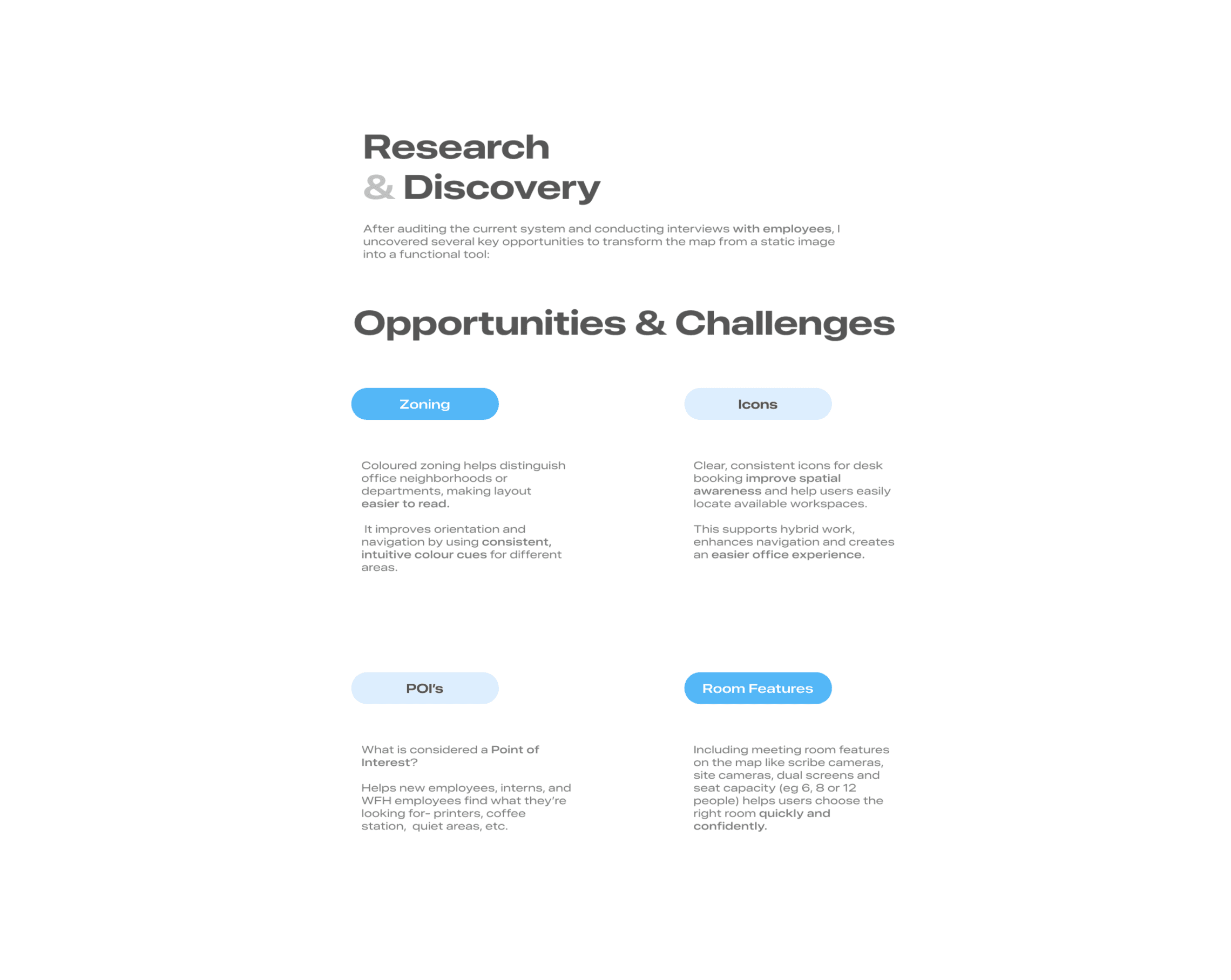
Navigating Logitech office spaces can be challenging for visitors, hybrid employees, and new hires.
The challenge was to evolve Logitech's basic, outline-only SVG floor maps into a polished visual design language.
The brief required introducing environmental depth, such as stylized 2D or isometric views, while strictly maintaining a flat navigation model that didn't require full 3D rendering or interactive capabilities.
Ultimately, the goal was to create a scalable, template-friendly system that balanced practical wayfinding utility with an engaging, visually appealing aesthetic for diverse customer layouts.
Below are some of the iterations and design explorations I created after gathering direct feedback from users on the initial interface.


/
Approach
(02)
I focused on building a clean layout that balances day-to-day office utility with simple cultural elements.
To address the brief's goal of making the workspace tool more interactive and less clinical, I focused on building a clean layout that balances day-to-day office utility with simple cultural elements.
Functional Navigation for Better Orientation
Essential Filters: I added clear filters for Meeting Rooms, Facilities, and Restrooms so users can quickly figure out where they are in relation to the office layout.
Custom Asset Creation: I built a straightforward icon set to establish a baseline visual hierarchy, aiming to make the floorplan easily scannable for someone on the move.
Finding a Balance with Visual DepthThe Approach: The brief requested a sense of depth, but full 3D modeling felt heavy and unnecessary for this specific tool. The client also mentioned they didn't have the internal capabilities to support a true 3D build long-term, but still wanted to explore what it could look like.
The Workaround: I did the initial 3D exploration to satisfy the brief, but pivoted to using isometric perspective tricks within 2D design software to keep the workflow practical and the files lightweight. This met their visual goals without introducing a complex technical overhead they couldn't handle.
Integrating Simple GamificationDynamic Backgrounds: To inject some personality into a standard corporate map, I used basic gamification principles inspired by how major platforms use seasonal themes.
Location-Specific Details: The interface adapts to celebrate local office culture and holidays depending on the calendar:
Cork, Ireland Office: Incorporates regional coastal imagery and St. Patrick’s Day themes.
Shanghai Office: Shifts styles to acknowledge Chinese New Year.
Global Milestones: Features temporary visual updates for the 4th of July and International Women’s Day.


/
Key Learnings & Growth
(03)
This project holds a massive personal milestone for me: it was the spark that launched my UX career.
Getting the chance to work on a design concept for a global brand like Logitech so early on was an incredible opportunity. Navigating the messy reality of user flows and real-world client constraints for the first time made me realize this was exactly what I wanted to do for a living.
Recognizing the gaps in my early knowledge, it inspired me to take action and formalize my training by enrolling in and completing the Google UX Design Professional Certificate. This project is where my UX design journey truly began, and I am grateful for the foundation it gave me.

Latest Projects.
A curated look at my work across UX, UI, and visual design.
Combining my roots in graphic design with digital problem-solving.

